Application Dashboard
This dashboard is used to give you insight on a particular application.
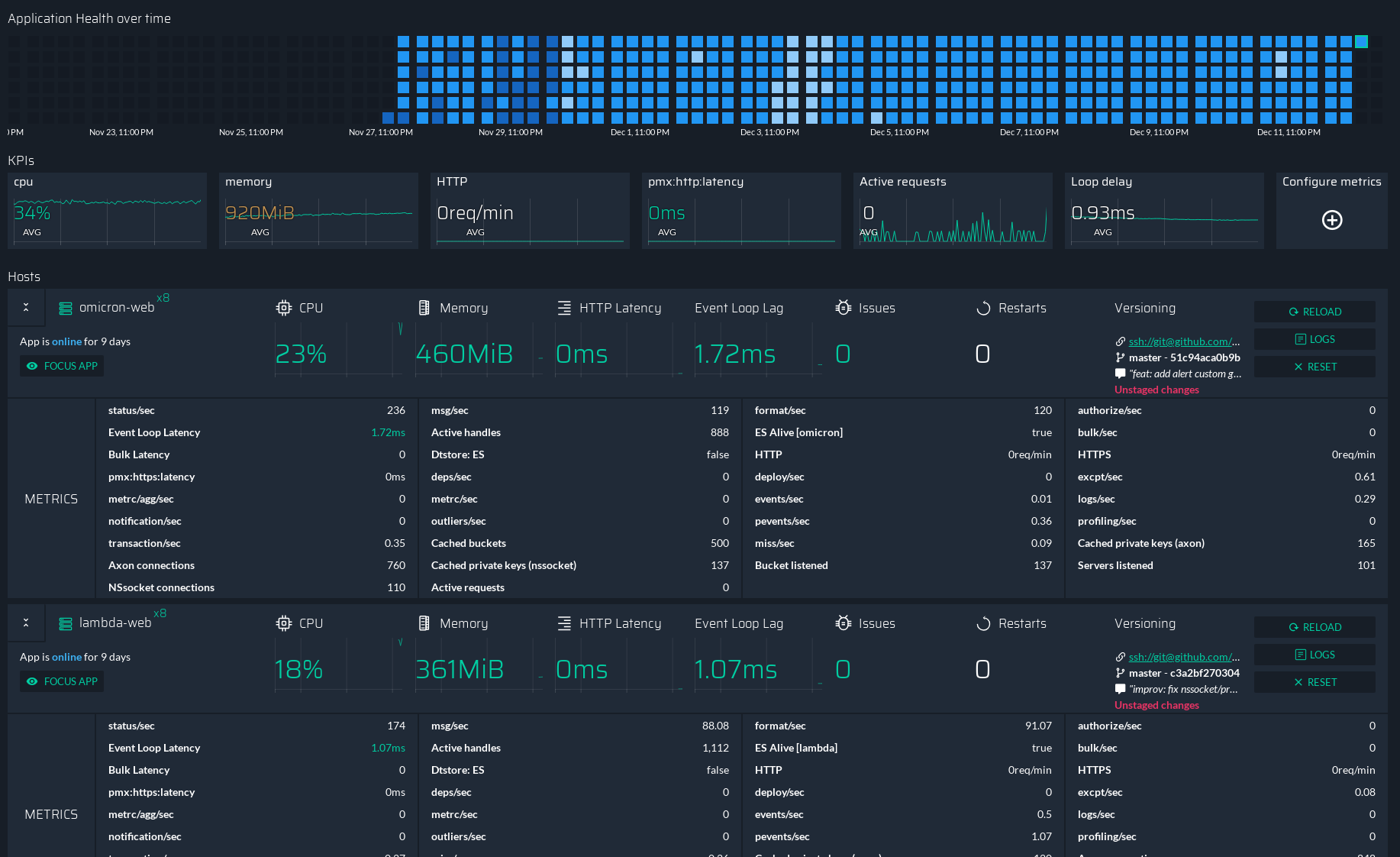
At the top you will see a map again, each of the rectangle represent one hour and its color depend on what was happening during this hour. Each color have a different meaning:
- Light blue means either a low cpu or memory usage (lower than normal)
- Dark blue means either a high cpu or memory usage (higher than normal)
- Blue means everything is normal
- Red means we received error about the application during this hour.
Then you have few metrics about this applications, for each metric you will have the historial value in the background and the realtime value in the foreground. You can customize those ones by clicking on Configure metrics at the far right of the screen.
Finally at the bottom, we will list each servers where your application is. And for each server, we will show you the metrics about the application on this specific server.
It’s pretty much the same view as the Servers overview expect there it’s only about one application.